Why create a Cross-Brand Design System for In-Store apps?
In EndeavourX we have a customer facing design system and an in-store design system for non-customer facing apps which focuses on functionality and accessibility.
Strategic Alignment across multiple brand for visibility to manage dependencies
Unified Experience across multiple brands for cohesive visual language
Centralized Governance across all 3 brands for managing updates and maintenance
Ease of Onboarding for designers and developers across all 3 brands
Shared Best Practices across all 3 brands for better user experience
What is the difference between In-store vs customer facing Design System?
In-store
In-store focuses on functionality and accessibility
All colors must pass WCAG AA and AAA
All fonts must be legible to read
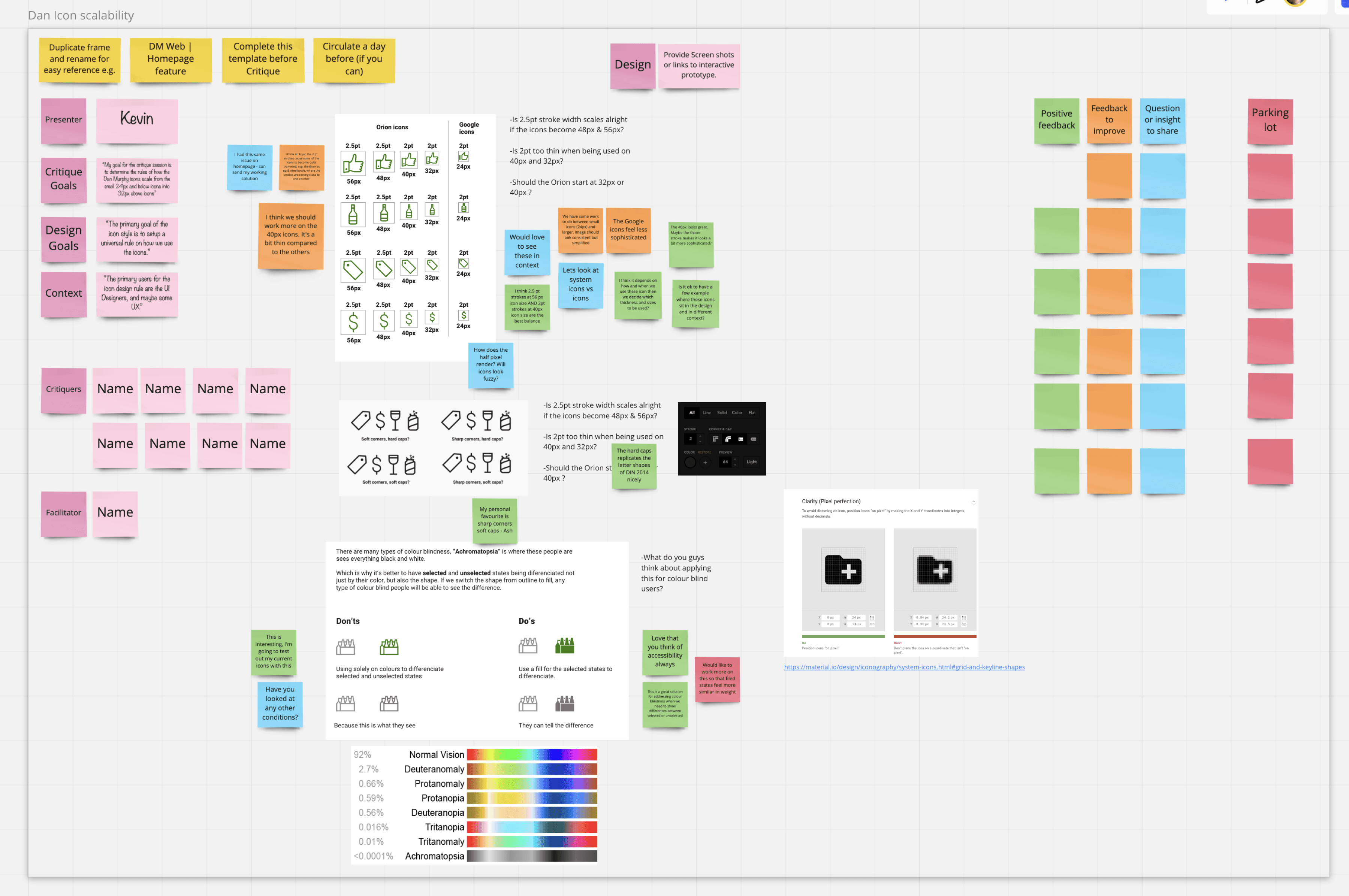
All icons must have fill and outline states to cater for color blind users
Customer facing
Focusing on brand and whatever marketing has put in the brand guidelines
All colors doesn’t need to pass WCAG
Font legibility is low priority
All icons can have any state as long as it adheres to the brand guidelines
Icon style rules
Like I said earlier, we have a dependency on finalising the icon styles with the creative/marketing team. And so I was trying to apply some pixel clarity rules around system icons and also to make our icons more accessible to colour blind users. I’ve pitched the idea on making the system icons and also the icons that are 32px and above having both outline and filled versions for the selected and unselected state.
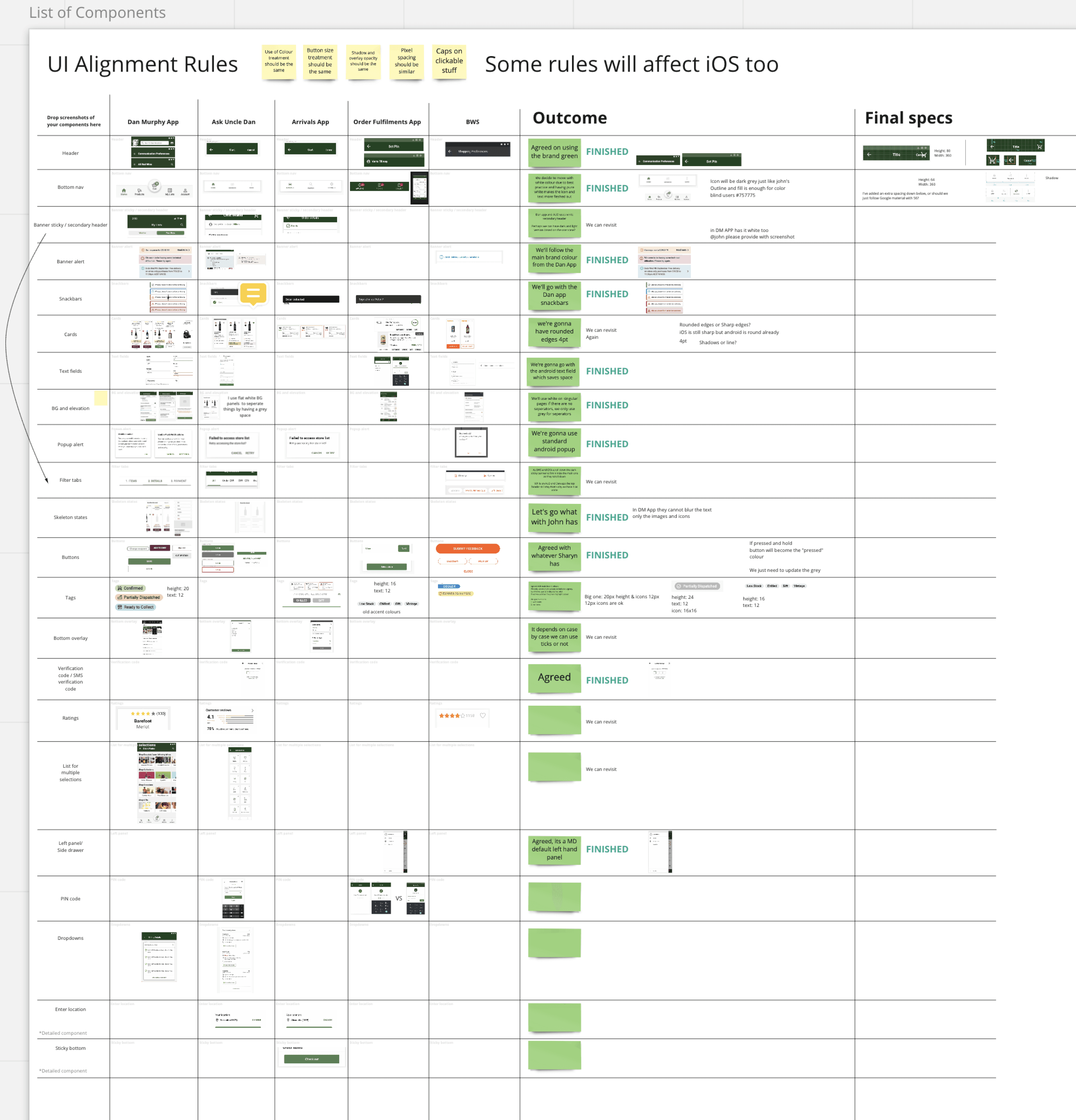
In Dan Murphys we got the commercial app and 20 in-store apps. Currently we’ve only designed 3 of them and even the 3 of them looks slightly different. And so it is mandatory to align everything now before we design more in-store apps.
So what I did is, I lead this initiative by creating workshops once every week. And within this workshop I’ve asked each designer of each app to put on the components listed on the left hand side (header, bottom nav, buttons, etc) and then we’ll explore each case and what each designer has to say and talk through which component should we declare as official.
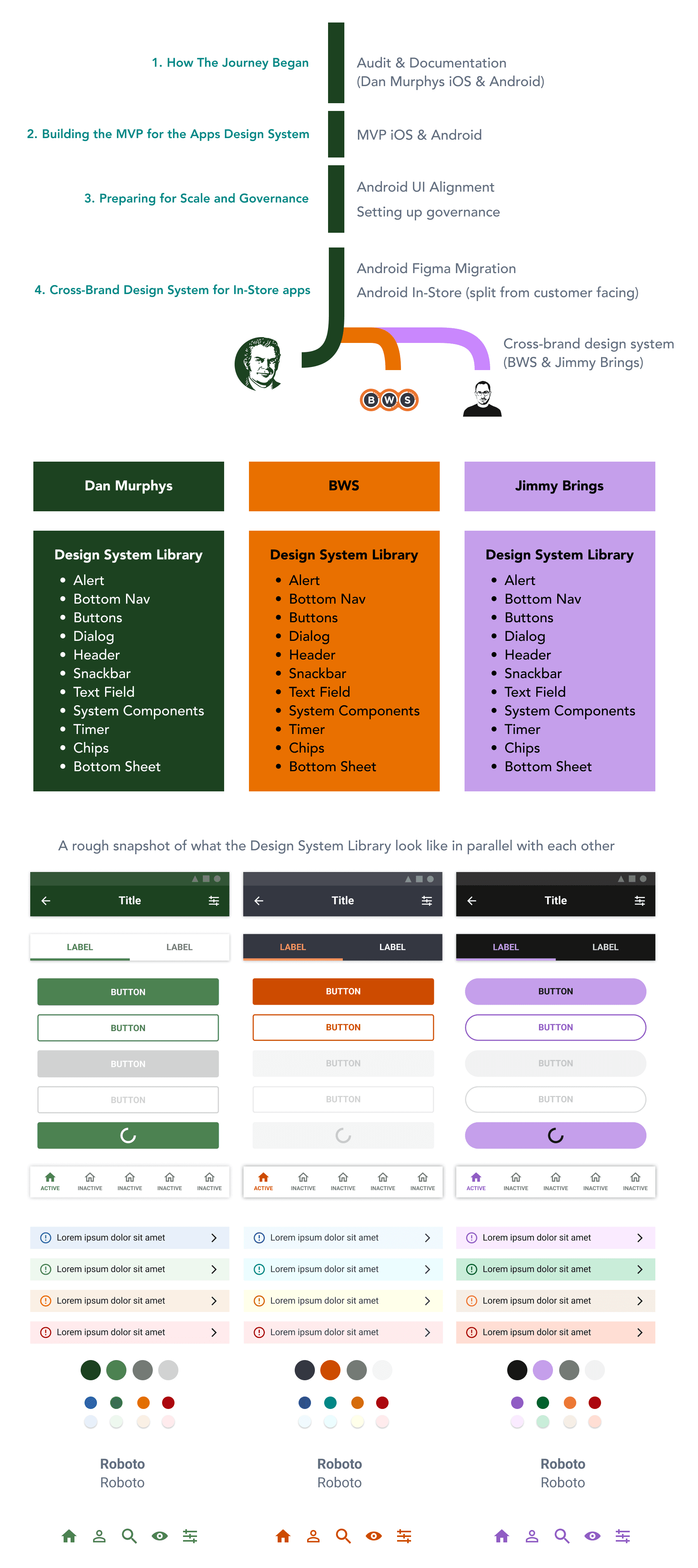
How The Journey Began
It was November 2019, the design maturity in EndeavourX is in it’s early stages and it is very important for us to set up foundational baselines moving forward to create consistency in order for a smooth adoption moving forward.
At the time, the team discussed the workload, I was in charge of designing the native app design system for iOS and Android.
What did I do?
Audited the whole Dan’s iOS & Android app
I started to map out all the components, from the types of headers, product cards, alerts, and various other components. I mapped out what Android and iOS are using in parallel with each other to see the differences.
I have also documented all the colors, text sizes and styles we’ve used in iOS and Android.
Start documenting all the findings
After the Audit I documented all my findings in Miro for team visibility and collaboration. We can go back to the documentation to reference if we need to.
Researching what is out there
I’ve researched the design systems that exist out there in 2019. Carbon, Orion, Westpac GEL, CBA Honeycomb, Google Material, etc. Seeing the best practice approach taken by each companies, listing the pros and cons.
Challenges
Current inconsistent use of colours and text
I found out that we have more than 20+ shades of brand colours that has a different hexcode than that was laid out in the brand guideline. There are also so many text sizes that uses inconsistent sizing and styles,
The Dan’s rebrand is happening at the same time when we do the project
There are a lot of dependencies with marketing and so it is difficult to finalize atomic components such as text and color.
But at the same time, it is a great opportunity to advocate for accessibility regarding WCAG. As the old colors didn’t pass the AA and AAA standards.
Thinking of how can we push all the standardized design components to all the existing apps
While documenting and making a UI library is feasible there are some unknowns on how are we going to push the finalized components in the future. We currently do not have the manpower or the resources to do so.
The head of design wanted to build up the reputation of the design team in order to gain more recognition to the upper management in order to expand the design team. The Dan Murphy’s design system is a perfect project upon doing so.
What did I do?
Built the Design System MVP for iOS & Android
I did all the UI focused heavy-lifting:
Gathering all the components.
Building the new pixel perfect components.
linked all the colors and typography to the components.
Aligned the text, sub component behaviors.
Testing to check if the components work flawlessly without breaking.
After the heavy lifting work, the MVP is ready to be used and shared amongst other designers. All the sketch design system library consist of:
Colors
Icons
Typography
Common components (headers, alerts, buttons, dialog, text fields, etc)
Showcasing the Design System
We showcased the Design System Library MVP and explained to the company what a design system is to increase the speed of efficiency of building digital products. We are doing this to get buy in from influential stakeholders to help convince upper management to fund the project.
Challenges
How do we structure the Design System
There are so many ways we can structurize the design system. In the end we decided to layout all the atomic elements such as colors, icons, typography in 3 separate files for MVP.
Consistency with naming conventions
As we are trying to create one source of truth, it is important for us to use common language. We used the naming convention used in Google Material because it is more recognizable by a wider audience in 2019.
Another challenge that we had is whether or not we need to use all small case, sentence case, title case, and also underlines to align with what naming convention the developers are using in their backend.
The company decided to use Invision to create tokens for each component to enable it to be reused and shared amongst the developers within EndeavourX. Invision can support HTML/CSS, Angular, React, but it cannot support other frameworks. Our iOS and Android apps use Swift, Kotlin and Flutter. And so for the apps it is just a Library where the developers will build the system themselves using their own existing platforms to store everything.
There are no dedicated resource for the iOS and Android design system at the time, the project went on a limbo mode for 1 year. And so I took initiative to lead the initiative until we can get a dedicated team to takeover. Android is more of a priority than iOS because the 3 in-store apps are using Android and so I take the lead on finalizing the android app design system.
What did I do?
Doing UI alignment sessions every fortnight
I gathered all the 3 other designers who are working on Android to a fortnightly session where we map out all the currently used components throughout 4 Dan Murphy apps in Miro.
We discussed the pros and cons of each component across 4 different apps to finalize one component with the best pattern. We either choose the best one or combine the aesthetics and patterns to create a better header, alert, snackbar etc.
Finalising the Android App Design System
After we finalized all the common components in the UI Alignment sessions. I started to build the Android App Design System based on the finalized components in order for all the android apps to have consistency.
I’ve done a master documentation on:
Components and Patterns
Design Principles and Guidelines
Usage Instructions
Accessibility Guidelines
The final documentation has been reviewed by designers across the company in two design critique sessions
Challenges
How the governance process will work
Within the UI alignment sessions I also discuss on how to scale up the design system by establishing:
Common versioning strategy
Component ownership
Review and approval process
Contributor guidelines
Onboarding new designers and developers
There are so many ways we can structurize the design system. In the end we decided to layout all the atomic elements such as colours, icons, typography in 3 seperate files for MVP.
The brand icons and colours aren’t finalised
Marketing/Brand never finalized the icons at all and they kept changing the colors. We can use the existing placeholders to work but because of this we need to hold off on working with the design system due to this dependency and focus on squad work
Limbo for the next 1.5 years
We are under resourced, and I am going back to back from squad work to working on updating the design system, as we do not have a dedicated resource for the apps design system.
Why create a Cross Brand design system?
Strategic Alignment across multiple brand for visibility to manage dependencies
Unified Experience across multiple brands for cohesive visual language
Centralized Governance across all 3 brands for managing updates and maintenance
Ease of Onboarding for designers and developers across all 3 brands
Shared Best Practices across all 3 brands for better user experience
After I have created the Android App Design System the design team is in a situation where we need to meet the retail customer facing requirements from marketing to make the components more colorful and flashy while in parallel we need the components to meet the in-store needs of being functional and accessible for users with disability. And so as a design team we decided to split the Android app that I created into a customer facing one, and an In-store one.
Within in-store we are going to deal with In-store apps for BWS and Jimmy Brings as well, and so the Tech Leads and I were in a discussion to create a cross-brand design system where the developers can reuse the component with the same naming convention for faster build promoting consistency, functionality and accessibility across Dan Murphy, Jimmy Brings and BWS.
What did I do?
Setting up governance system with other designers in-store
I’ve created fortnightly discussions with other designers who are involved with the app to discuss:
Design System Updates
Feedback and Issues
Component Requests and Contributions
Design and Development Alignment
Versioning and Release Planning
Migrating the Dan’s Android App Design System into Figma
After a year long effort of convincing the business to change from Sketch & Invision into Figma, the time finally comes where I migrate everything by converting and checking if anything breaks after the Sketch to Figma conversion.
I created the BWS and Jimmy Brings version of the Android App Design System for Dan’s
Changing the colors to match BWS and Jimmy Brings. I kept the typography the same one which worked for Dan’s because legibility and WCAG AA and AAA contrast is a high priority. Keeping naming convention across all 3 design systems so that the developers can build the code repository with speed and minimal effort.
Challenges
Uncertainty for adoption towards existing components
Even though we have a repository for Dan Murphys we don’t have the developer resource to update the components into the existing apps because most of them are busy with squad work.
Onboarding developers for the Design System in Figma
The developers are new to Figma, we need to onboard them because they are going to build the code repository based on the design system library in Figma. And so, I need to onboard them first and also discuss the next steps on how to structure the code repository with standardized naming conventions for the cross brand design system. This will help them build the code repository to create their own tokens
Back


